Anatomy of a Blog Template
I know most of you probably won't find this very interesting but I thought I would share a few tricks that I use in my Blogger and Wordpress layouts. I believe that most people think that the vertical and horizontal lines on the background of the pages that I draw actually "hold" the text areas in place. Well, that's completely untrue in a CSS (cascading style sheets) layout, I can put the text anywhere on the page. It is true however when using a table based layout. With CSS you can place the text virtually anywhere you want on the page, the images are just there as a background decoration.
This is a Blogger template I'm working on today for my friend Desy over at Afro Nerd. He liked the first one so much he wants me to build another and set him up with a theme switcher, so visitors can switch the themes back and forth.
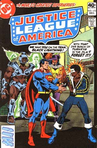
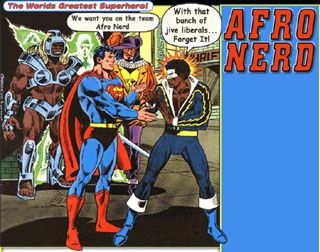
The first image is the original comic book cover he wanted used, but it needed a lot of Photoshop editing to make it useable. Once I was done editing the text and cropping out the unwanted sections, I drew up the entire page layout around the image, which you can see in this second image.

That image is the entire page including the heading text but it isn't quite ready for use yet, it has to be sliced up into 3 pieces to make up the different sections of the page. There's the header (top section), the content (middle section that can expand up and down as the page gets longer) and the footer to dress out the bottom of the page.
In the next 3 images you can see what each piece looks like after it's all chopped up and ready for use.
This is the header below:
The very narrow strip that makes up the center or content section actually "tiles" in all the way down the page as far as it needs to to fill out the page. Anything thicker would just be a waste of bandwidth and take longer to load.
This is the center section below:

This is the footer below:

And the footer image just caps off the ends of the columns to give the page a cleaner, finished appearance. A lot of designers leave that out and just let the columns run right off the page. That's personal preference though, most people probably never scroll all the way to the bottom anyway. Sometimes, I insert small "surprise" images in the footer to go with the theme.
There are several tricks involved in using this method to do page layouts and not too many people do it this way. I like it because it allows me to use subtle shadows and glows and complex borders and I can simulate a more 3 dimensional aspect to the layout. This helps achieve a more dynamic affect with higher visual impact. And you'll notice that it easily allows me to put the action figures in this example, in poses that makes it look like they're stepping out of the frames and overlapping into sections that you wouldn't normally see. However, a very attractive blog or web page can be built without using any images at all. Background colors and borders can all be written into the code to set the overall appearance.
If you'll notice, the sidebar will have to come way up and over the right hand side of the heading image so that it ends up just under the red title "Afro Nerd". I'll use negative top margin numbers to pull that text up to precisely where I want it within a single pixel of accuracy.
Personally, I just enjoy manipulating images in Photoshop and bringing them to life on the web, It's a lot of fun. The very first thing I do to start a design is draw up the entire page background before I write any of the code. That's just the way I do it! Hope I didn't bore you guys too much!


<< Home