Friday, March 09, 2007

Sunday, March 04, 2007
I Stumbled It
Users get to add their favorite sites and everyone that stumbles on that site behind them gets to vote thumbs up or thumbs down, right from your browser. You can even choose different channels as you surf. They have communities and you get your own pages that list all your own favorited sites and you can mark people as friends or contacts based on your personal interests. I found out that it works much better with Firefox, I found several issues using it with IE 7. Give it a try, you'll like it!
Here's a couple of photos of a bronze statue that I stumbled on recently, that made me go WTF??? That's just crazy! I think it's in Denmark.

 You would never see anything like that in the USA! I could just imagine an artist proposing something like that to the local city council. "You'll be able to see WHAT??? And you want us to pay for it??? Get out the tar and feathers!!!! LOL
I'm thinking about my moving my blog again and finally going over to Wordpress with my own domain. Hell, I might as well, I've got 6 different Wordpress installations running right now but half of them are used for designing templates for customers. I've been on Blogger now for about 2.5 years and I'll miss it, it's been a pretty decent home for the most part and I've made a lot of great friends here as well. It does have it's aggravations and annoyances though. I've even bought a name that I like and it's already hosted, in fact I now own 8 different domain names for my various web endeavors. The only problem is finding the time to get it set up and build a new design. Eventually!
Hope you guys are having a good weekender!

Monday, February 26, 2007
Anatomy of a Blog Template

I know most of you probably won't find this very interesting but I thought I would share a few tricks that I use in my Blogger and Wordpress layouts. I believe that most people think that the vertical and horizontal lines on the background of the pages that I draw actually "hold" the text areas in place. Well, that's completely untrue in a CSS (cascading style sheets) layout, I can put the text anywhere on the page. It is true however when using a table based layout. With CSS you can place the text virtually anywhere you want on the page, the images are just there as a background decoration.
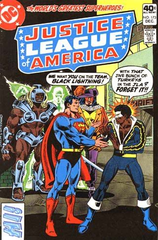
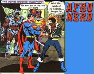
This is a Blogger template I'm working on today for my friend Desy over at Afro Nerd. He liked the first one so much he wants me to build another and set him up with a theme switcher, so visitors can switch the themes back and forth.
The first image is the original comic book cover he wanted used, but it needed a lot of Photoshop editing to make it useable. Once I was done editing the text and cropping out the unwanted sections, I drew up the entire page layout around the image, which you can see in this second image.

That image is the entire page including the heading text but it isn't quite ready for use yet, it has to be sliced up into 3 pieces to make up the different sections of the page. There's the header (top section), the content (middle section that can expand up and down as the page gets longer) and the footer to dress out the bottom of the page.
In the next 3 images you can see what each piece looks like after it's all chopped up and ready for use.
This is the header below:

The very narrow strip that makes up the center or content section actually "tiles" in all the way down the page as far as it needs to to fill out the page. Anything thicker would just be a waste of bandwidth and take longer to load.
This is the center section below:

This is the footer below:

And the footer image just caps off the ends of the columns to give the page a cleaner, finished appearance. A lot of designers leave that out and just let the columns run right off the page. That's personal preference though, most people probably never scroll all the way to the bottom anyway. Sometimes, I insert small "surprise" images in the footer to go with the theme.
There are several tricks involved in using this method to do page layouts and not too many people do it this way. I like it because it allows me to use subtle shadows and glows and complex borders and I can simulate a more 3 dimensional aspect to the layout. This helps achieve a more dynamic affect with higher visual impact. And you'll notice that it easily allows me to put the action figures in this example, in poses that makes it look like they're stepping out of the frames and overlapping into sections that you wouldn't normally see. However, a very attractive blog or web page can be built without using any images at all. Background colors and borders can all be written into the code to set the overall appearance.
If you'll notice, the sidebar will have to come way up and over the right hand side of the heading image so that it ends up just under the red title "Afro Nerd". I'll use negative top margin numbers to pull that text up to precisely where I want it within a single pixel of accuracy.
Personally, I just enjoy manipulating images in Photoshop and bringing them to life on the web, It's a lot of fun. The very first thing I do to start a design is draw up the entire page background before I write any of the code. That's just the way I do it! Hope I didn't bore you guys too much!

Monday, February 19, 2007
A Little More Like This...
A while back Wal-Mart stole nearly $300 from my bank account by using a Mastercard debit card number that I had once used for a legitimate purchase. The billing didn't list any items purchased, just money "removed" very weird! I knew immediately it had to be someone on the store end that got into my account info because that card has never been out of my possession and to use it even online you have to have the card in hand for the 3 digit security number on the back. That means the only way they could have gotten that number was through the Wal-Mart records. I disputed it and the money was returned about a week later. My bank told me that Wal-Mart had 45 days to dispute the charge back. I kept worrying that they would give me trouble over it but I finally got notice that the grace period was passed. So I guess I get to keep MY frikkin' money, how nice of the bastards! It was a relief though, I just wish I could press charges for the theft. Can I send Wal-Mart to jail? Now that would be cool!
It's Mardi Gras here, ho-hum... LOL I have yet to go to a parade, maybe I will this weekend. I've been enjoying the King Cakes though, damn those things are so good! Chewy and gooey and delicious, just what I need for my expanding waist line. Don't swallow the plastic baby inside!
 I was going thru some of my photos and came across a few that I took in New York on one of my visits to see Lisa. I don't think I ever posted them. One night we went out to watch Deni of Last Girl on Earth blog play at a gay bar near downtown New York City. They were having some kind of gay, wacky costume contest and not only was Deni playing violin but she was one of the judges of the contest. That contest was strange! The bar was strange, everything was strange! I just stayed real close to Lisa and luckily no one hit on me LOL Now that I think back about it, should I be insulted? Hmmm. We actually had quite a good time, but I don't think I would go back. hehehe

That was pretty much one of the coolest violins I've ever seen and she really can play it too! I'm looking forward to my next trip to visit Lisa and Deni and hopefully Julie too, I hope to go sometime soon.
See ya'll!! =)

